What are the best resume fonts and sizes? Here's how to decide.
According to studies, a recruiter will only spend between 10–30 seconds looking at your resume. If you want to convey the most value to the recruiter in that short amount of time, choosing the best resume font is super important.
Most people don’t realize that different fonts can actually effect reading speed dramatically.
If you choose a bad resume font, the recruiter might be able to read 5% of your resume in those precious 30 seconds.
But, if you choose a great resume font, that same recruiter might be able to read 25% or more of your resume.
👉 And the science supports this.
Peter Yang, CEO of the resume writing company, Resume Go, explains that in a recent study:
“The best resumes — where recruiters spent the most time and focus — had clearly marked section and title headers, all written in a clear font.”
Choosing your resume font, similar to choosing your resume color, can give you a distinct advantage over other candidates.
And, choosing a strange font, can actually make your resume less “ATS-friendly” (I’ll explain what this means below).
So, in this article I’ll show you:
- 7 of the best resume fonts you can choose
- How to choose the best resume font for your resume
- How to use font styling to make your resume stand out
Finally, I’ll show you how to choose 2 resume fonts for your resume (and yes, you should choose 2 fonts, not just 1, I’ll explain why).
Alright, so let’s jump into the 7 best resume fonts and how to pick the one that works best for you.
Table of Contents
(Tap to jump straight to a section)
1. Why do resume fonts matter?
2. Should you use Serif or Sans Serif?
5. How many fonts should you use?
What Is The Best Font For A Resume?
If you’re looking for a quick answer to, “what is the best font for a resume?” here are two great choices:
Best font for resume headlines: Open Sans
Best font for resume body: Arial
Both of these fonts are good, safe choices to use on your resume. They are easy to read, look professional, and are ATS-friendly fonts.
So, if you’re looking for a safe resume font choice, go with Open Sans and Arial.
However, if you’re interested in taking your resume to the next level and making it uniquely yours, keep reading.
Why your Resume Font Matters?
Most people don’t realize just how much thought goes into a font. Some fonts are designed for print, some for digital.
Steve Jobs famously dropped out of college because he found the classes weren’t really teaching him anything useful.
There was one class, however, that Steve Jobs said had a huge impact on his professional career: calligraphy.
Reflecting on the experience, Steve Jobs said:
“[In my calligraphy class] I learned about serif and sans-serif typefaces, about varying the space between different letter combinations, about what makes great typography great. It was beautiful.
None of this had any hope of any practical application in my life. But 10 years later, when we were designing the first Macintosh computer, it all came back to me. And we designed it all into the Mac.
It was the first computer with beautiful typography. If I had never dropped in on that single course in college, the Mac would never have multiple typefaces or proportionally spaced fonts. And since Windows just copied the Mac, it’s likely that no personal computer would have them.”
In this post I won’t get too deep into why certain fonts are better than others, but it’s important to understand that fonts aren’t just “pretty” or “ugly.”
👉 Fonts can actually make a document easier or harder to read.
👉 Fonts can even make us perceive a document as more or less valuable.
Because a recruiter will only spend 10–30 seconds looking at your resume, it’s crucial that you make your resume as approachable as possible. And that’s exactly what the best resume fonts do.
In addition to this, you also want to make sure that your font is “ATS-friendly.”
An ATS (also known as an applicant tracking system) is a piece of software recruiters use to scan your resume.
The good news is that most ATS these days can read 99% of fonts. It's only if you choose a very strange font that an ATS could struggle to "parse" your resume.
You can read more about how ATS systems work and how to optimize your resume for them here.
The 7 resume fonts I’ll share in this article are all ATS-friendly, so you won't have to worry about that.
First, let’s talk about how to choose the best type of font for your resume.

Should you use Serif or Sans Serif fonts for your resume?
A lot of people are intimidated by font jargon, but don’t worry, I’ll break this down in very simple terms.
There are two types of fonts: Serif and Sans Serif.
“Serif” fonts are the fonts that have the little “tails” on the end of each letter. The text you’re reading right now is a serif font.
“Sans Serif” simply means “without serif.” Sans Serif fonts are ones that don’t have tails on end of the letters.
Here is an example of a serif vs sans serif font:

Where to Use Serif Fonts on your Resume
Serif fonts were created to make books easier to read. The little “tails” on the ends of each letter help guide your eye to the next letter.
It is generally accepted that serif fonts are faster to read when they’re in small sizes.
If we only have 10–30 seconds of a recruiter’s attention, we want to maximize the amount of content that the recruiter can consume.
👉 This is why using a serif font for the body copy of your resume is generally better.
There are exceptions to this rule, such as Arial. In a minute, I’ll share the best fonts to use in your resume. But first…
Where to Use Sans Serif Fonts on your Resume
Sans Serif fonts are useful in larger sizes where there aren’t too many words (such as headlines). They generally look very clean, but are slower to read.
👉 Because there are very few titles on a resume, you can actually get away with using either a serif or sans serif font.
When choosing a font for your resume titles, feel free to play around with both serif and sans serif fonts. This is how you can add some personality to your resume in addition to places like your resume summary.
If you want a resume template that already includes great ATS-friendly fonts, you can get my 2 favorite resume templates for free by entering your email here.
7 Best Fonts For Your Resume
Most experts agree that there are 7 best fonts for resumes. Let’s break down what each one is good for and help you choose the best font for your resume.
(Note: If you’re missing any of the following fonts, you can download them for free from Font Tree or Google Fonts)

Best Resume Font #1 | Merriweather
Merriweather is one of the best resume fonts because it was designed to be pleasant to read on screens. It has slightly condensed letters, which is great when you’re trying to fit a lot of information on your resume, but you also don’t want it to feel crowded.
Merriweather is the font that I use on my personal resume and I’ve had lots of compliments on how “approachable” my resume feels. I’ve also had several of our GHYC members say that this font worked very well for them. This is also the favorite font of the AI resume builder, Rezi.
👉 If you're looking for a font that conveys a friendly feel, Merriweather is a great resume font choice for you.

Best Resume Font #2 | Georgia
Georgia is one of the best fonts for your resume because it’s similar to classic serif fonts, but has a bit more of a modern feel. It also has wider letter spacing than other traditional fonts, such as Times New Roman. Many people say that Georgia is a very easy font to read and this is why The New York Times uses Georgia for its newspaper.
In a recent post, Paulina Valdez Franco, Executive Recruiter at HubSpot, agrees with this take.
“My two favorite fonts are Helvetica, if you’re looking for a clean and classic look, and Georgia, if you’re going after a more modern and fun look. The latter (Georgia) is also designed to read well on screens.”
👉 If you're looking for a font that conveys a smart feel, Georgia is a great resume font choice for you.

Best Resume Font #3 | Times New Roman
If you want to be on the more formal side, Times New Roman is the font for you. Times New Roman is a good font for a resume because it is easy to read and conveys qualities of being “reliable” and “respectful.” Many recruiters say that they prefer less creative fonts (like Times New Roman) because they want to concentrate on the content of the resume, not the styling.
However, there are some other recruiting experts who say that Times New Roman can actually make a resume look very boring and a bit too serious.
Glory Montes, Technical Recruiter at HubSpot says, “I would stay away from a font like Times New Roman because it’s overused and reminds me of long nights writing course papers in college.”
I personally think that Times New Roman can look at bit too conservative, but it really depends on the audience your resume will be read by.
👉 If you're looking for a font that conveys a professional feel, Times New Roman is a great resume font choice for you.

Best Resume Font #4 | Arial
If you want to use a sans serif font for your body copy, Arial is your best bet. Arial is known as having “humanist characteristics,” which means it’s very approachable and feels inviting. Despite being a sans serif, it’s still easy to read on a screen because it’s letters are very consistent sizes.
Arial is very similar to Helvetica and Calibri, so any 3 of those fonts will have a similar feel. I’ve personally read many resumes using Arial and usually find them very neutral in feel. When it comes to best resume fonts, Arial is definitely the best sans serif for body copy.
👉 If you're looking for a font that conveys a clean feel, Arial is a great resume font choice for you.
Best Fonts for Resume Headlines:
As I mentioned earlier, because there are very few headlines on a resume, you can be a lot more free with the fonts you choose here (as long as they are ATS-friendly fonts of course).
Here are 3 fonts to try for your name and headlines:

Best Resume Font #5 | Garamond
Garamond is one of the best resume fonts because of its elegant letter design. Some people recommend Garamond as a font for body copy, but I actually think it works much better in larger sizes.
Try using Garamond for your name on your resume and see if you like it. I personally love the contrast Garamond offers to the more conventional body font choices.
👉 If you're looking for a font that grabs interest, Garamond is one of the best resume fonts for you.

Best Resume Font #6 | Helvetica/Open Sans
Helvetica is one of the most popular fonts in the world (there’s even a feature-length documentary about this font). Helvetica is used by many big brands including American Airlines, BMW, The North Face, Crate & Barrel, and many more. So, if you want to convey a professional, clean design on your resume, Helvetica is an excellent font choice.
Unfortunately, true Helvetica isn’t available for free. But, there are Helvetica equivalent fonts, like Open Sans, that you can get for free. You can try to use Helvetica/Open Sans as your body copy too, but I think it works better as headline copy.
I use Open Sans for my headlines and name on my personal resume.
👉 If you're looking for a font that conveys a modern feel, Open Sans is one of the best resume fonts you can choose.

Best Resume Font #7 | Verdana
If you’re looking for a great font for your resume that has a clean feel, Verdana could be what you’re looking for. Verdana was created for Microsoft. It has wider proportions and looser letter-spacing than print-orientated fonts like Helvetica.
If you’d like to give your resume a modern look, but don't want to go with a super common font like Helvetica, give Verdana a try. It is particularly nice for headlines, in my opinion.
👉 If you're looking for a font that conveys a modern feel, Verdana is one of the best resume fonts you can choose.
How Many Fonts Should You Use on your Resume?
It’s best to use no more than two fonts on your resume. Much like using color on your resume, you should aim to keep things simple and clean.
I personally like to use two fonts. I use one font for the body text and one for the headlines, to add some visual interest. I recommend keeping your body font restrained and easy to read. But, feel free to experiment with your name and headline text and use something that you feel speaks to you.
What Size Fonts Should You Use On Your Resume?
There is a lot of misleading information about what font size is best for a resume. Any website that gives you a blanket statement like, “use size 14 font for your body copy,” hasn’t actually tested all the fonts.
Every font has unique sizing characteristics and needs to be adjusted accordingly.
Here is an example of Verdana in size 14:
This is what Verdana looks like in size 14 font.
And here is an example of Garamond in size 14:
This is what Garamond looks like in size 14 font.
As you can see, size 14 in Verdana looks good, but size 14 in Garamond is way too small for most people.
With the resume fonts that I use (Merriweather & Open Sans) I use the following:
Body copy — Size 9 font (Merriweather)
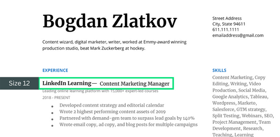
Headlines — Size 12 font (Open Sans)
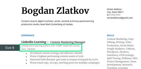
Secondary info — Size 8 font (Open Sans)
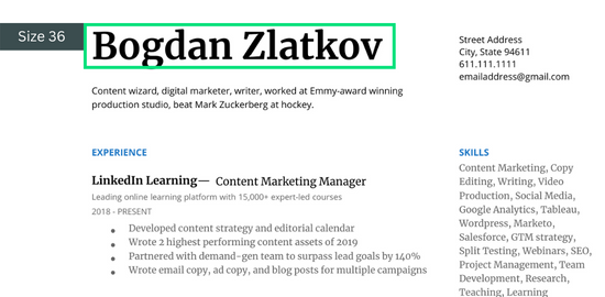
Name — Size 36 font (Merriweather)
When choosing the fonts for your resume, it’s best to think about your fonts in relative size. Here’s how:
Body Copy
Your resume body copy should be in a size that’s easy to read when the resume is at 100% magnification. I recommend opening your resume on a laptop screen as a PDF and look at it on 100% like this:

👉 Remember that recruiters look at between 100–200 resumes per day.
They also often look at resumes on a laptop while they’re on the go. If you can’t read your resume, chances are they won’t either.
Headlines
Your resume headlines should be at least 2 points bigger than your body copy. These include items such as your job title and company name. You can also use color or capitalization to draw attention to them (more on that in just a minute).
Secondary Info
Secondary information is anything that you don’t need the reader’s eyes to go to until later. This includes your dates of employment, company descriptions, and other non-essential descriptions. I recommend using 1 font size smaller for this information.
Name
Your name can be as big as you like as long as it fits nicely within your resume template. I usually recommend a resume font size of 24 or larger for the name section.
Remember that under your name you should also have an eye-catching resume summary that intrigues the reader.
And again, if you’d like to just use the template above with all the fonts already set up for you, you can get it in our free resume course here.

Adding Visual Interest To Your Resume Fonts
The final piece of your resume fonts you can play around with are the styling. This includes capitalization, italics, bolding, and color.
These elements can be used to add visual interest and weight to your resume. Here is how to use each element:
Capitalization
Putting information in all caps can bring attention to a piece of your resume. I recommend using all caps to make your resume section headers stand out. Along with bolding and color, this can add visual weight to each section and make it easier for the reader to navigate your resume.
Italics
Putting information in italics is the opposite of capitalization. It will draw attention away from that information. I recommend using italics on things like your contact information, company descriptions, and any other secondary information on your resume.
Bolding
Bolding can be used to draw attention to a piece of information, but it should be used sparingly. You can use bolding on your headers and also within your accomplishments. Make sure you only bold 1–3 words on your resume and not entire sentences though.
Color
Color can be used to draw attention to certain sections of your resume. However, color can affect how ATS-friendly your resume is, so I recommend reading our full guide on how to use color on your resume here.
Don’t worry too much about using all of these techniques. But, if you do use some of them, make sure you’re keeping everything ATS-friendly.
There are some simple ways to do this.
Resume writing expert, Virginia Franco, says that most job seekers can make their resume ATS-friendly in under 10 minutes.
Here’s a useful video where Virginia explains what you keep in mind:
Takeaways And Next Steps
Okay that was a LOT of information about resume fonts. Hopefully this guide didn’t overwhelm you.
The truth is that the best resume fonts are usually the simple ones. It’s a choice that you have to make, but don’t sweat your choice too much.
At the end of the day, the content in your resume is what matters most. Like I cover in our free resume course, your resume is the sum of many small choices and each choice is easy to make (when you have the right information).
So, choose one or two of these best resume fonts and then move on to the next steps. If you would like a step-by-step guide on how to build your resume, you can get our free video course by dropping your email below:
More from the blog

Good Weakness for Interview: How to Craft the Perfect Answer (+10 Examples)
Good Weakness for Interview: How to Craft the Perfect Answer (+10 Examples)One of the biggest...
Top 9 Questions for Second Interviews: What to expect & how to answer
Top 9 Questions for Second Interviews: What to expect and how to answer Congratulations! 🎉 If...
The Ultimate Guide to Interview Prep: strategies, scripts, & questions
The Ultimate Guide: How to Prepare for an Interview (scripts, strategies, & more!) “If you try...
Like this? Try our free courses!
Tired of sending your job applications into a black hole and never hearing back? Get hired faster with our guided courses all for FREE!
Bogdan Zlatkov is the Founder of GHYC and author of "The Ultimate Guide to Job Hunting", ranked #1 on Google. He has been featured in the Wall Street Journal, Fast Company, HR Dive, and more. At GHYC, Bogdan creates job search courses & tools by working with award-winning career coaches, best-selling authors, and Forbes-Council members. Prior to GHYC, Bogdan led the content programs at LinkedIn Learning.
